


APEXX servers millions of payments everyday. One of the biggest challenges with growth - give merchant self-setup options.
Simplify the payment form customisation from raw CSS code. Almost no merchants can customise payment forms themselves. Our onboarding managers need to customise it for them, and of course, as with any communication between people, it becomes messy.
A checkout form should come with a modern design that matches the website’s layout. It needs to look like it belongs on the site. So, when running a current, elegant online store, make the checkout look smooth and sleek.
This is more or less an internal task for the APEXX team. We collect a hundred+ complaints from our customer support and implementation managers. The main job for us is to increase the adoption and automation of the merchant portal.
All our existing users will need a payment from customisation in several forms: iframe for integration on their payment pages or dedicated payment page to use it for “Pay By Link”.
The idea of “Pay By Link” is simple. Merchants need “Pay By Link” to sell online without a website. Create a full payment page in just a few clicks and share the link with customers.
Of Consumers can't use the payment form setup on their on.
Of Consumers interested in "PBL" solution, according to survey
Maintain all aspects of product design. Create a prototypes for different concepts. Support the MVP development. Work with analytics for checking functionality of ideas.
I mainly communicate with the internal team to collect the main user pain point. The top problem, of course, is the fact that 99% of merchants won’t customise anything too hard.
They need a simple, reliable UI tool to customise the form. Ideally, support asks to add guides and instructions for merchants on how to set up customisation.
One more thing that we found during the demo onboarding session is that all merchants need form and email customisation. These two things are super connected and should be similarly looking.
I can highlight a few conceptual things that users will need from new payment; it should be:

Each piece is part of a greater whole and should contribute positively to the new APEXX design system at scale. There should be no isolated features or outliers.

The use of motion breathes life into our products and allows us to communicate with users in easily understood ways.

APEXX is used around the world by a vast global community. Our products and visual language should be welcoming and accessible.

Figma for UI, Prototypes and the design system.

Miro for product work flows, user flows, user stories, etc.

Webflow for web-based concepts and prototypes.

Adobe After Effects to animate prototypes.

Hotjar & Google Analytics to collect the data for future analytics.
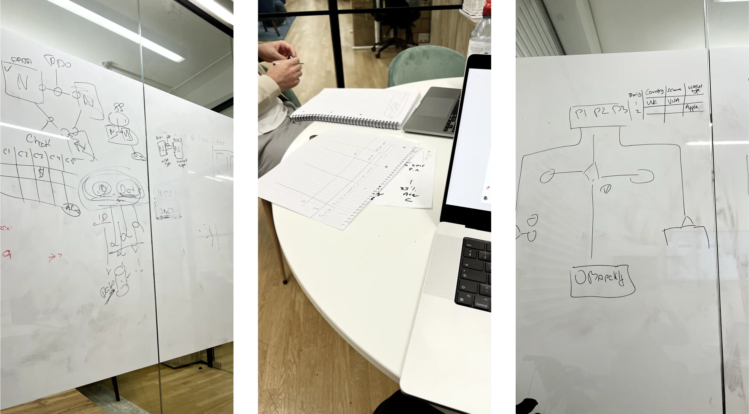
There is no ready to use the solution in today’s market for something like this. So there is no easy way to grab refs. I faced a unique UI challenge that required a lot of brainstorming for the team.
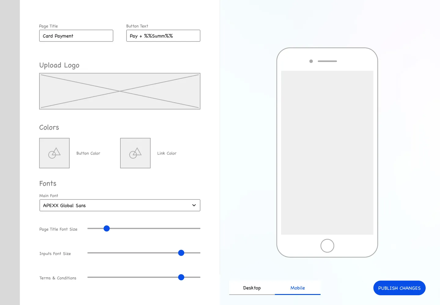
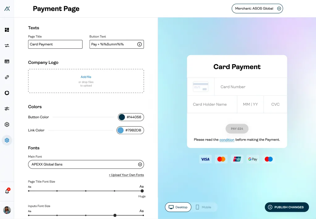
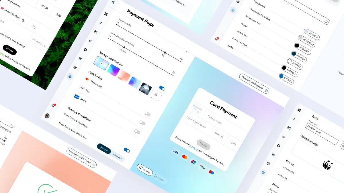
One of the main UX challenges here is to bring visibility to user. For this purpose, I’ve split the screen into two parts.
The left part is dedicated to editing itself with a scrollable line of controls.
The right part is a live preview. It changes everything that user switches on the fly.
Everything you see at the right part is a live demo of a payment form that can be used as natural form to check all the states.
It was essential to show the preview not only for desktop but also for mobile. Because based on statistics, more than 44% of all our merchant’s payments happen from mobile devices.
We can identify these options for customising the form:
Let’s talk a bit about a card form. So my main idea for the card form was to make it reusable and adaptive for any surrounding conditions.
I got a grid / boxy layout from this idea; this layout can be modified and adjusted to any device screen size of a validation error.
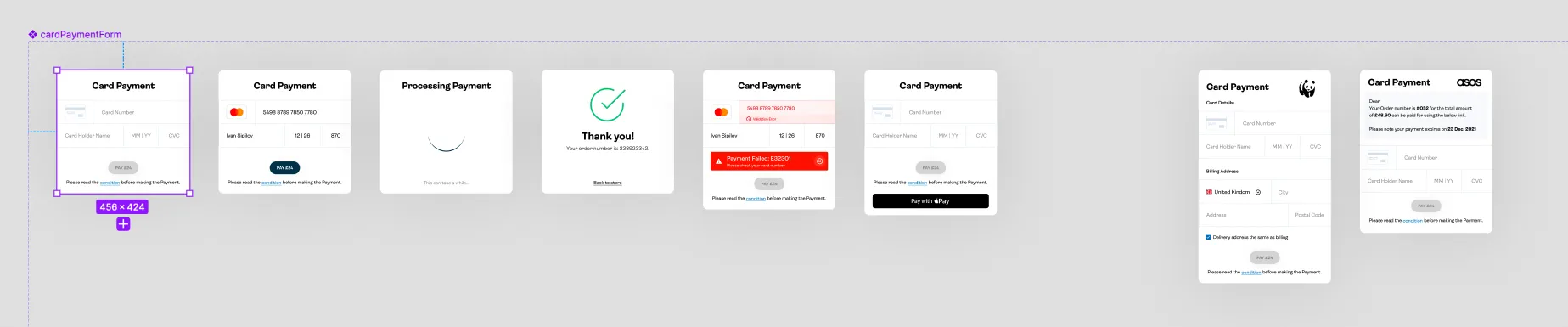
And, of course, this form is designed to be responsive. We genuinely care about the user’s awareness of what is happening. The card form has all the needed validations, messages, and states inside the APEXX design system.
Based on the CXL Institute study, the information in single-column forms is easier to understand as users’ eyes go more naturally.So, a single-column layout eliminates the risk that users will misinterpret your checkout form. However, several fields are needed to be sent to another line without confusing users.
For better UX, we provide auto-completed and auto-filled form fields. For example, we use geo-targeting and pre-fill the fields with a city name and state. You can also ask for a ZIP code first and then auto-fill areas with address details.
I arranged the form fields from easiest to hardest. This is one of the UX basics that is more than useful for the payment forms.
I can write even more about our research and conclusions about the card form. But let’s come back to the central customisation theme.
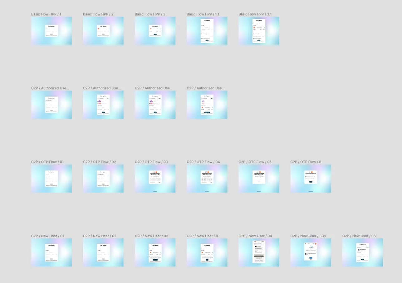
So sad enough, we didn’t have the luxury of beta realises and A/B tests for this feature. Due to the different circumstances, we relied only on the advanced Figma prototype to show to key stakeholders and customer support.
The main insides that I get from this prototype run with the team are:
The iFrame customisation is slightly different from the page. The main difference is that iFrame is not an independent product; it should be a mini crate to the merchant’s pages. So for these purposes, I added more control for UI form modifications:
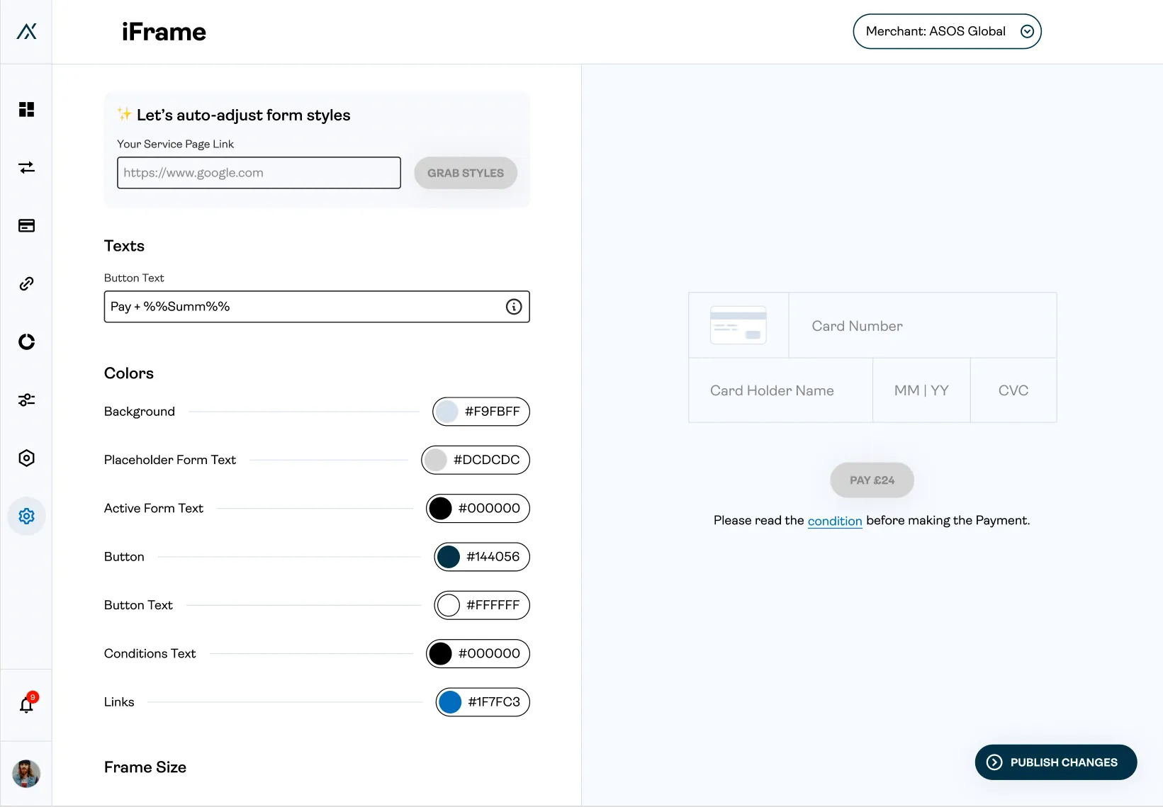
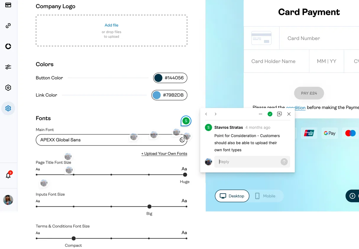
Merchant can change the button colour and all colours on the page, with the same colour selector component from the APEXX design system.
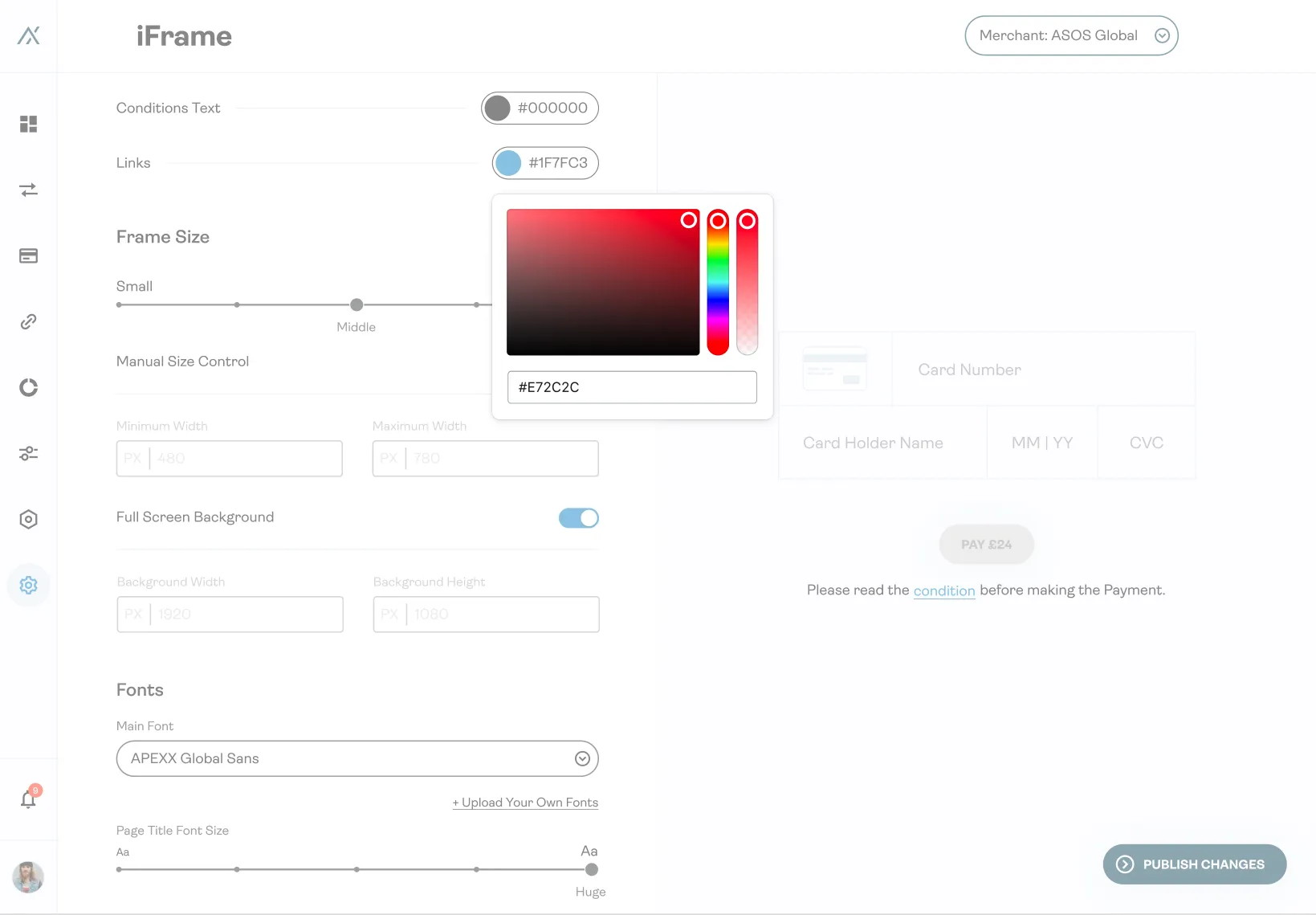
The frame size can be manipulated as well. We need to stick to the HTML&CSS logic here to add all the parameters for the actual website page. This means we need a min-width and max-width for the form.
Lesser of two evils is to customise the iFrame, but after discussing this with the internal support team, we felt this becomes too hard for a merchant.
To reduce am amount of actions required from merchants, I created this:
All that we ask to do merchants is to enter a checkout page link in our magic “auto-adjust form”. We will parse all the CSS from their website—the colours, pictures, fonts, and all other styles can be easy grab automatically.
Everyone inside the APEXX team was amazed and surprised by such an elegant and straightforward solution. I can’t wait to see it in real-world usage.
We discussed before that all the development investments are high. From the survey/interview part, we know about needed email customisation. So I decided to combine the same logic and controls for the email customisation:
In the example above you can find a quick example of the email customisation for ASOS UK.
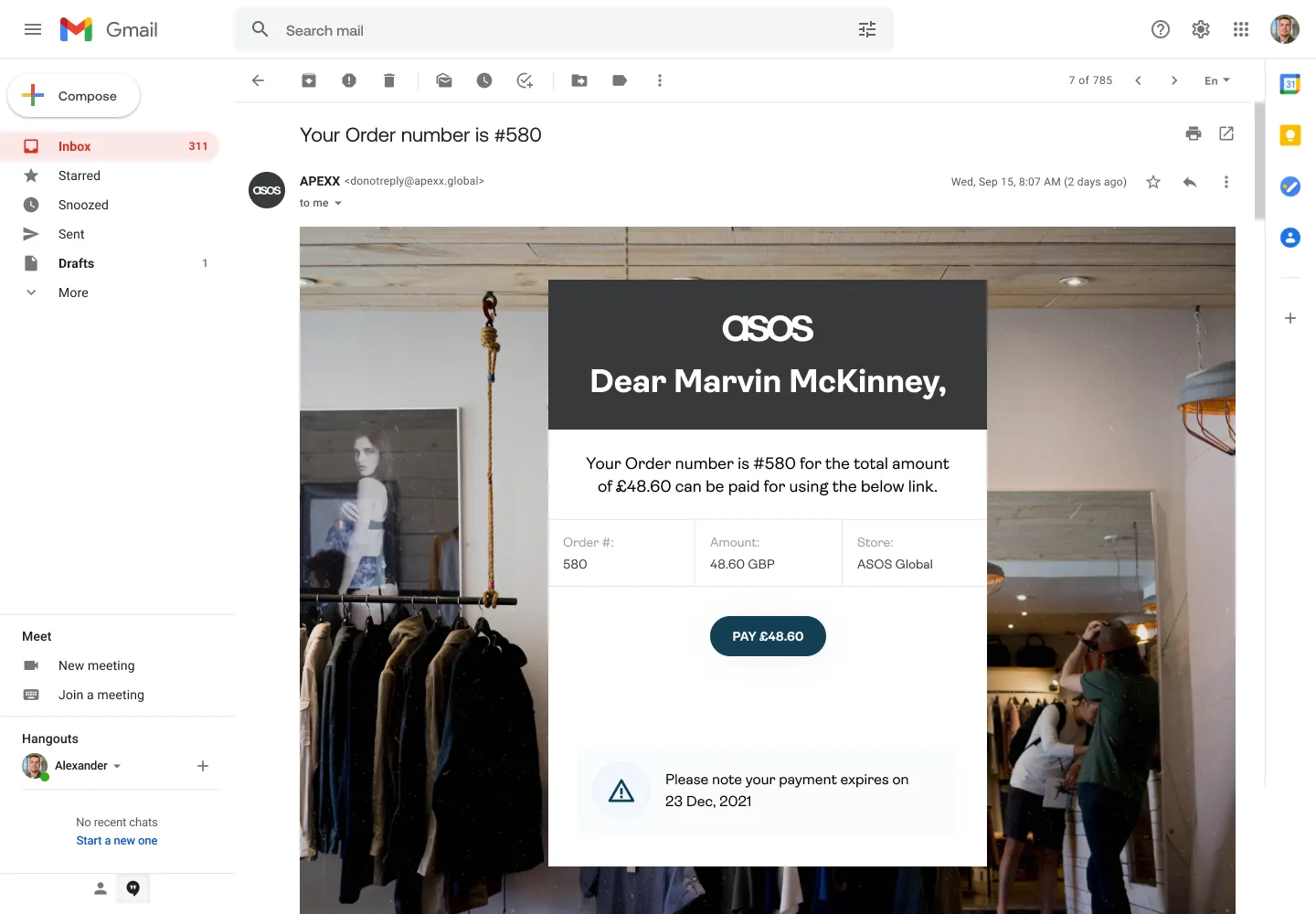
In the problem description, I have mentioned that we need a payment form for the “Pay By Link” functions in the portal. So let’s take a look at the PBL itself:
You can see how all this becomes a combining part of the big system.
Few things worth mentioning. All the payment links emails come from user templates:
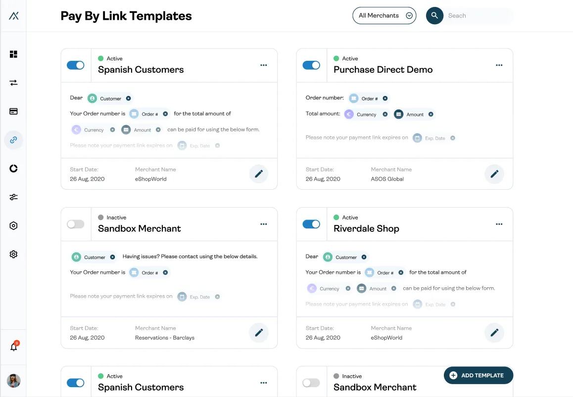
Here is the basic flow of how a user can create a template:
Interesting thing is that we reusing the same structure again with the left preview part. And we add a custom dynamic data variables.
One of the main goals of animating UI is to simplify the number of elements that the user sees. Here is an example of how 4 to 5 BNPL options can be combined with one small animation:
It’s a pretty simple but attractive animation, done with vanilla CSS.
The main challenge for me was to add all the unusual controls and unique logic into the reusable React components. If we already invest a lot of development time for custom controls for payment forms, let’s reuse them in other sections of the product where they can be helpful.
We already built our product on the component base thanks to the react core logic, but it wasn’t enough. The design in the first place should be prepared and adopted for multi-purpose components.
The complex, unique components always should be designed reusable. This will justify the spent time and effort.
Automations is a great way to save time and bring positive emotions to our end users. It’s 2022; if your service can do something without needed user input, automate it.
